There are 26,570 AI agents in one inventory. Each is a new identity with its own risk posture. That's the problem.
the problem
Every agent is a new identity — and its risk is scattered everywhere.
Organisations are spinning up thousands of AI agents — copilots, Copilot Studio agents, custom bots. Each one is a new identity with its own risk posture, and the signals about that risk live across four separate Microsoft security products.
As a flat table, the inventory hides the structure. You can't answer the basic questions: which agents are risky, and why? Which risks are systemic — shared across hundreds of agents? And how did we get here over time?
signals scattered across four products
Defender10 Entra8 Purview7 Intune3
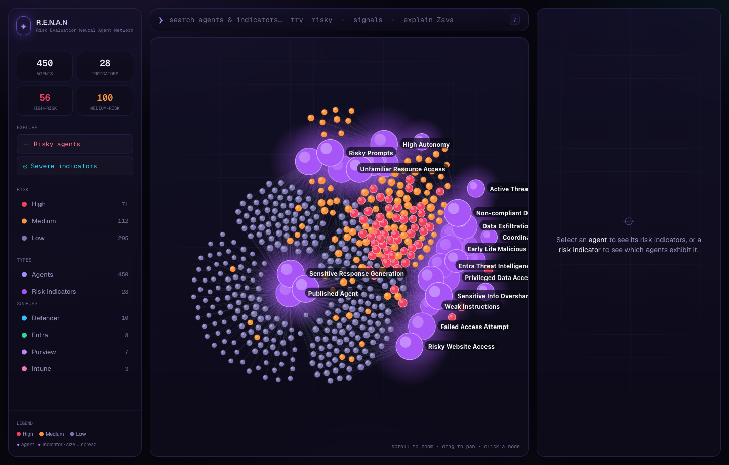
The raw signal: hundreds of agents, dozens of risks, four products, no single view.
the insight
Risk isn't per-agent. It's shared. So I stopped using a table and drew a graph.
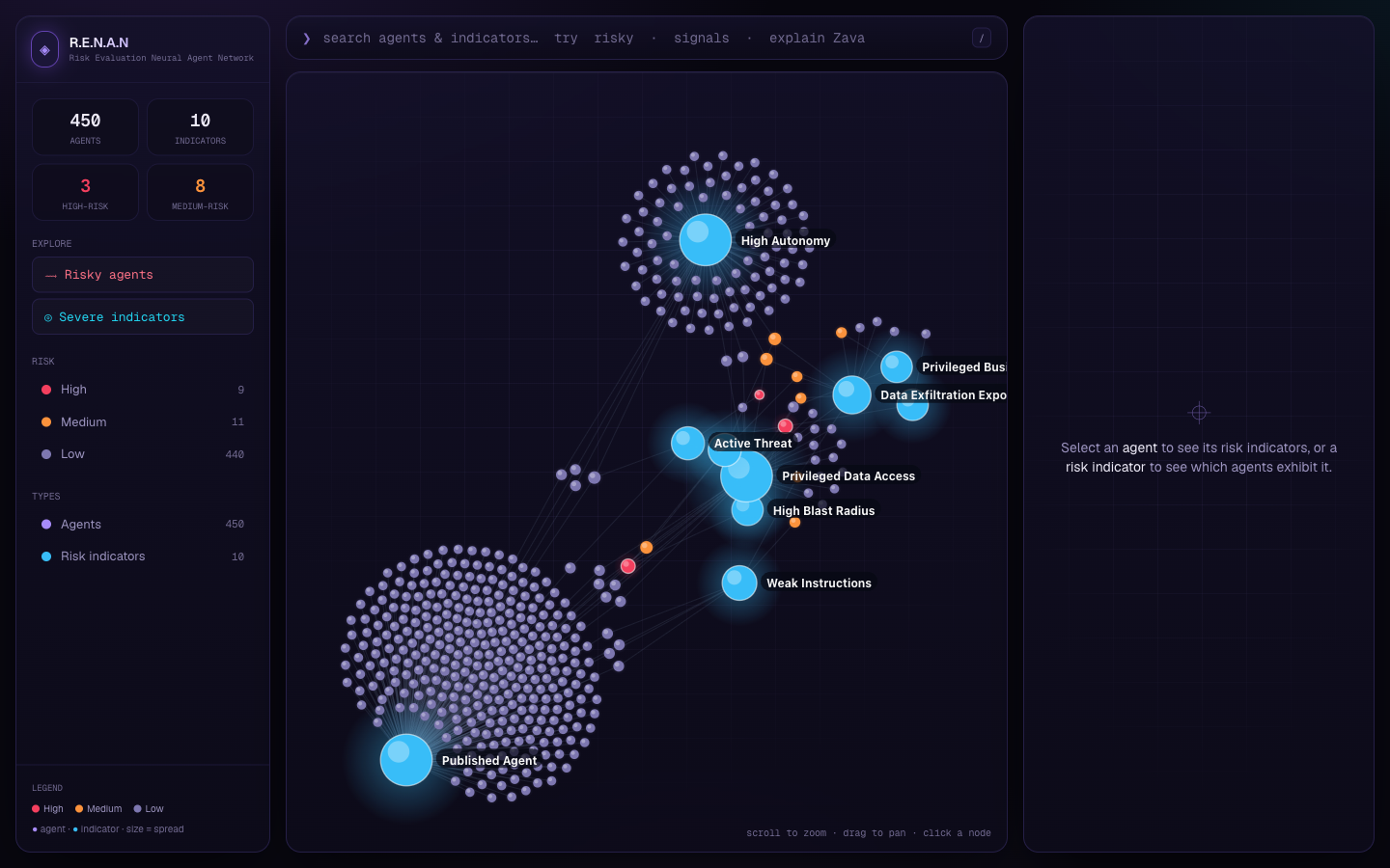
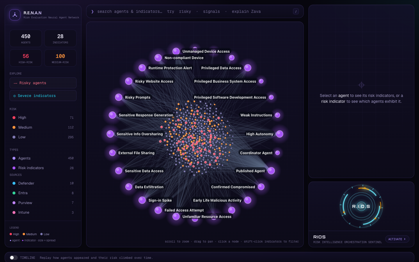
The same handful of risks recur across hundreds of agents. So I made each risk indicator a hub and let agents cluster around the indicators they exhibit. The systemic risks become the biggest, most central nodes automatically; an agent's risk profile is just its spokes.
One graph answers both questions at once — how exposed is this agent, and how widespread is this risk — with no per-product silos.
scattered signals…
“Risk is shared — so model it as a graph.”
the thesis the whole project turns on
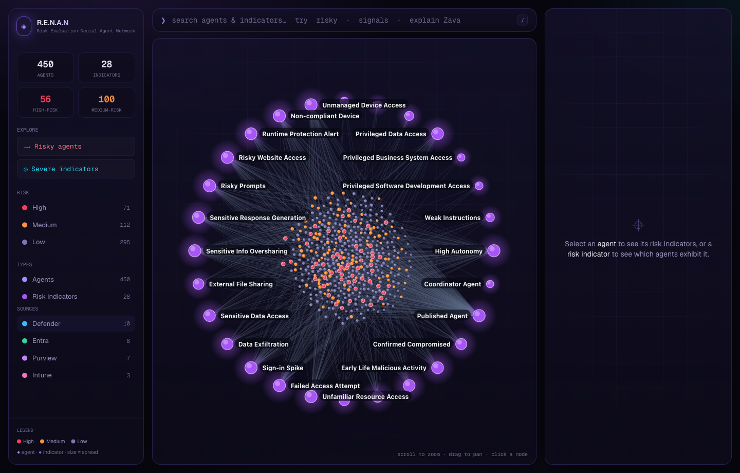
v1 — the whole idea on screen at once: a custom canvas force graph.
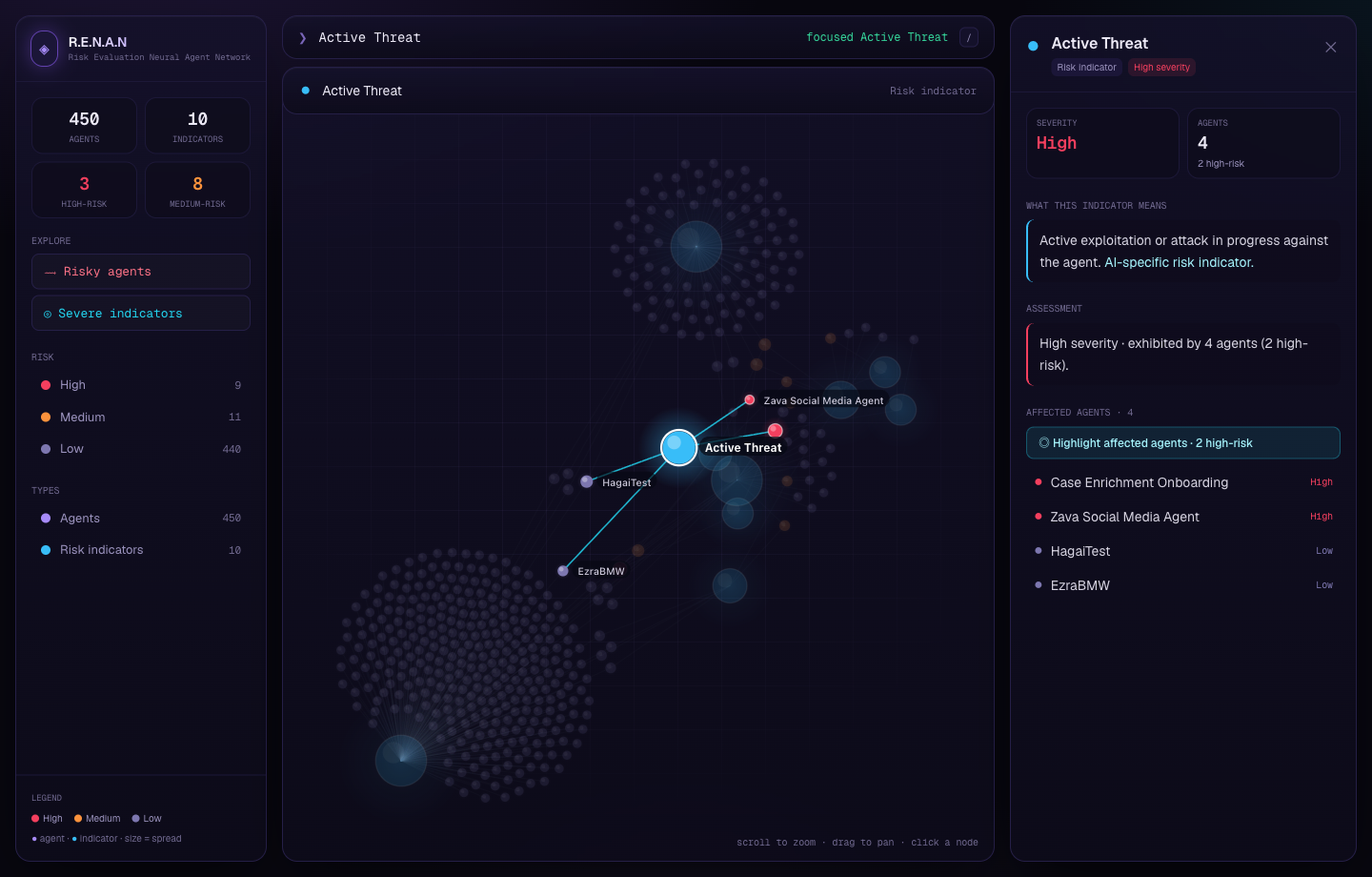
Click a risk → every agent that has it. Selection is symmetric.
the journey
Eight iterations in four days.
It starts with what security teams work with today — a flat table. Over four days and eight iterations, it became R.E.N.A.N. The graphic on the right tracks the build.
today
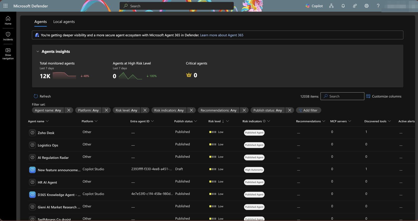
Today — the agent inventory as one long, flat table.
the status quo · in production
How it looks today
The status quo → thousands of agents in one flat list.
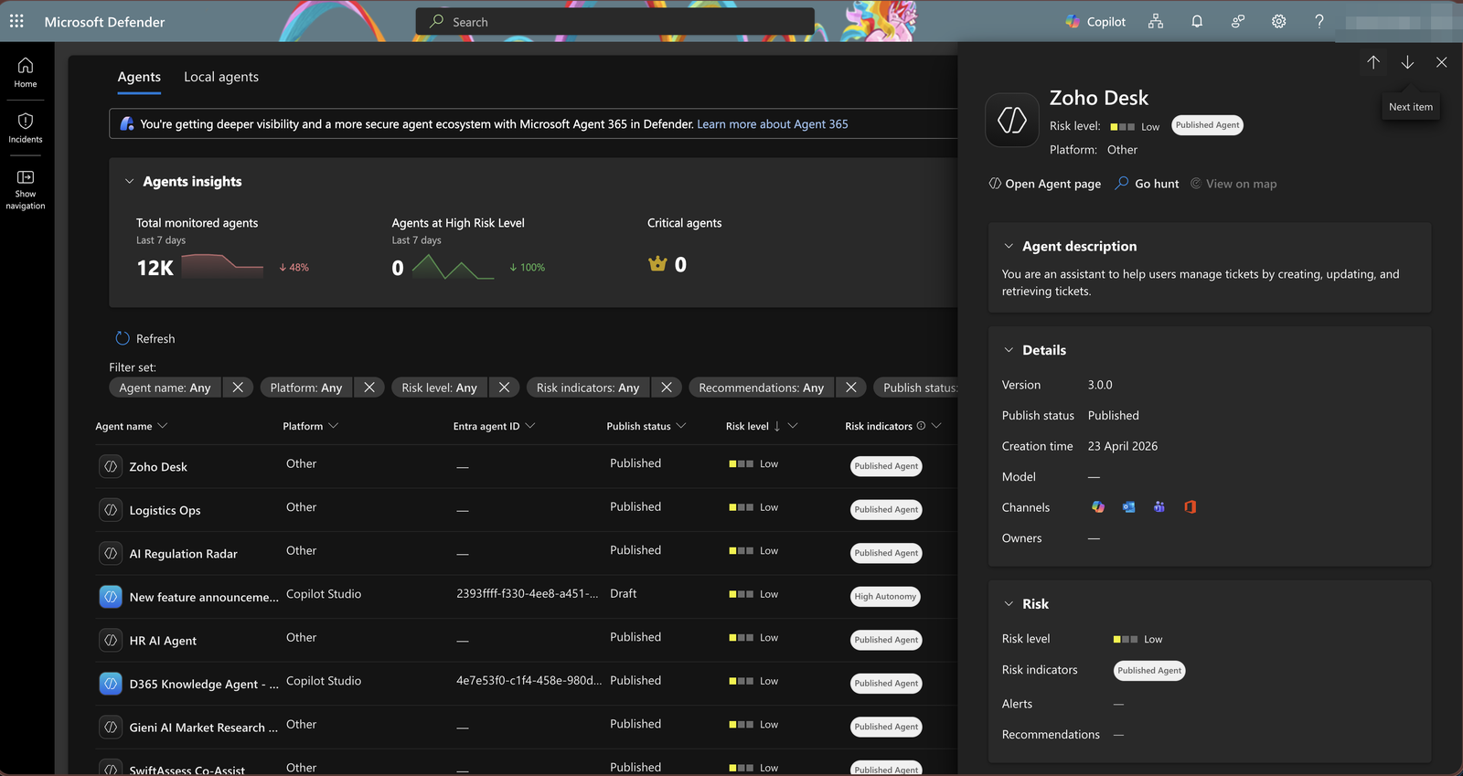
This is what security teams work with today: Microsoft Defender lists AI agents as a flat inventory — thousands of rows, one per agent, almost all tagged “Low”. You can sort and filter, but you can't see which risks are systemic, which agents share them, or how any of it connects. The signal is there; the shape of the problem isn't.
detail
v1
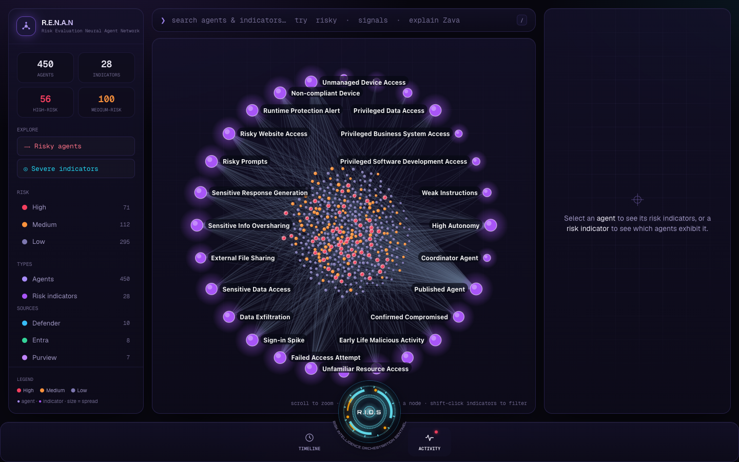
v1 — custom canvas physics, cyan hubs, a command terminal.
git checkout v1
A working graph
An idea → a custom 2D canvas force simulation.
It started the day before, in a conversation with a partner on the security team who walked me through a new Defender view where AI agents appear as risk-bearing assets. I pulled the inventory that night; the next morning the first real build put the whole idea on screen — a hand-rolled velocity-Verlet force simulation rendering agents around cyan risk hubs, a dark violet HUD aesthetic, symmetric selection (click an agent → its risks; click a risk → its agents), and a “/” command terminal. Rolling the physics by hand, instead of a graph library, is what made every later visual choice possible.
detail
v2
v2 — real data, 28 indicators across Defender/Entra/Purview/Intune.
git checkout v2
Make it real
Synthetic sample → ~450 real agents, OCR'd from Defender.
I swapped the synthetic data for ~450 real agents transcribed from Defender AI Agents (preview) inventory screenshots via an OCR + hand-verification pipeline, and expanded the taxonomy to 28 indicators across four Microsoft sources. Real agent names and models made the demo credible — reviewers saw actual copilots and their actual detections, not lorem-ipsum risk.
detail
v3
v3 — the ring layout that fixed the hairball.
git checkout v3
Tame the hairball
Free-floating cluster → indicators pinned on an outer ring.
With 450 agents and 28 hubs, a free layout became a hairball. Pinning every indicator on an evenly-spaced outer ring around the agent cluster — and retuning the force constants — made the hub-and-spoke structure legible again.
v4
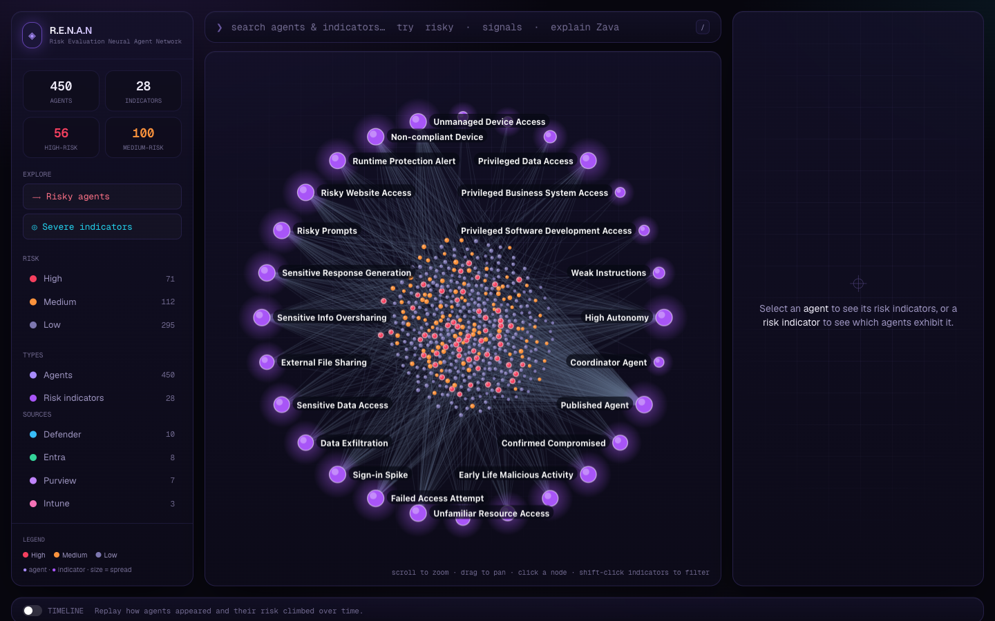
v4 — R.E.N.A.N branding + the timeline replay.
git checkout v4
Identity + time
A static snapshot → branding, a timeline replay, and a deploy.
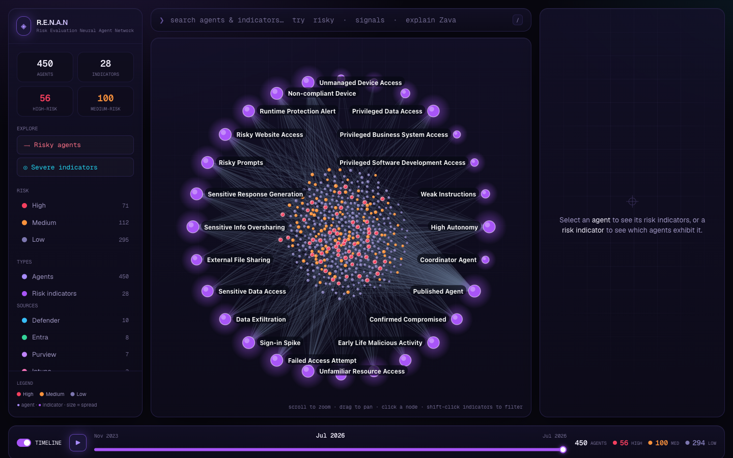
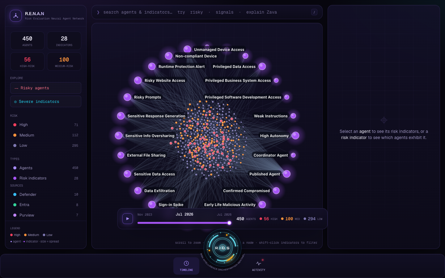
The product became R.E.N.A.N with a network-node glyph. Two big interactions landed: a timeline that replays how agents appeared and how their risk climbed over their lifespan, and a multi-select intersection filter (shift-click several indicators → agents that have all of them). It was static-exported and deployed to Netlify behind HTTP Basic Auth.
detail
v5
v5 — RIOS, the arc-reactor voice assistant.
git checkout v5
Give it a voice
A graph you read → a graph you talk to.
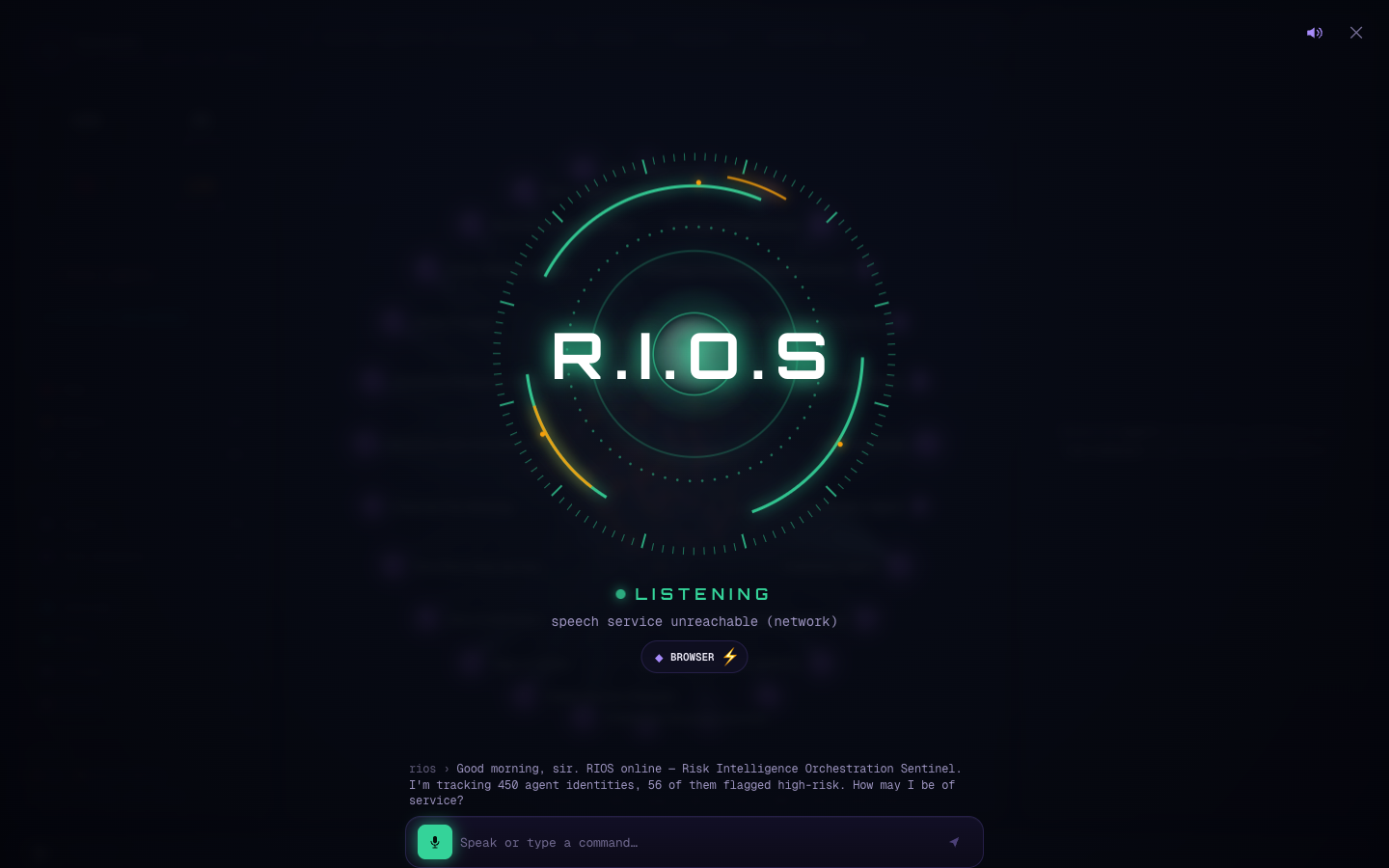
The most distinctive iteration: RIOS — Risk Intelligence Orchestration Sentinel — a JARVIS-styled voice assistant. The design principle was grounded-first: an always-on local engine answers from the live graph and returns the exact node ids it used; an optional LLM only rephrases those facts and can never invent numbers. RIOS doesn't just chat — it operates the interface by voice and flies the camera to the nodes it cites.
detail
v6
v6 — the graph behaves like a real security console.
git checkout v6
Make it live
A still graph → a running SOC console.
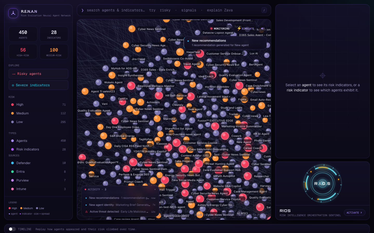
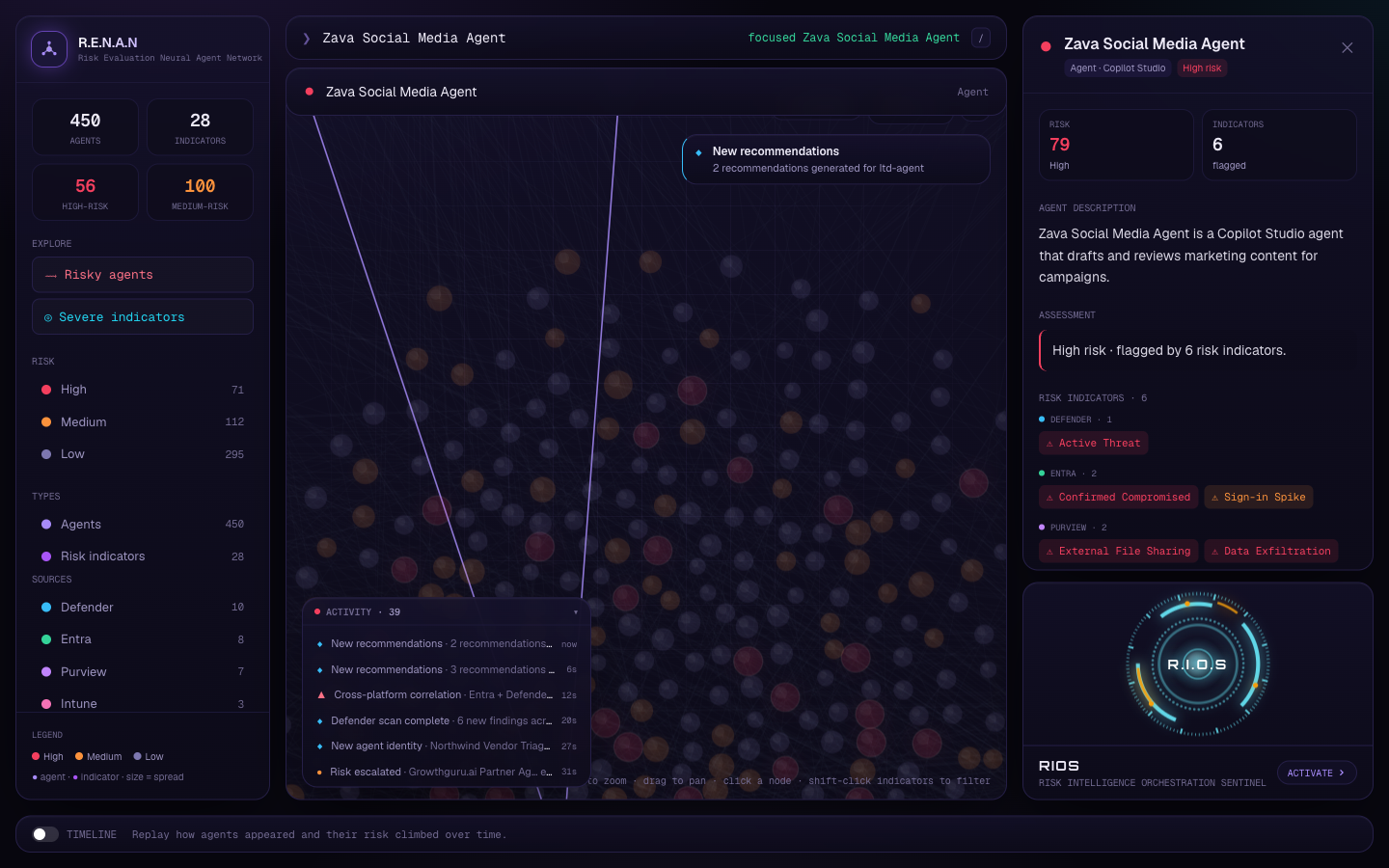
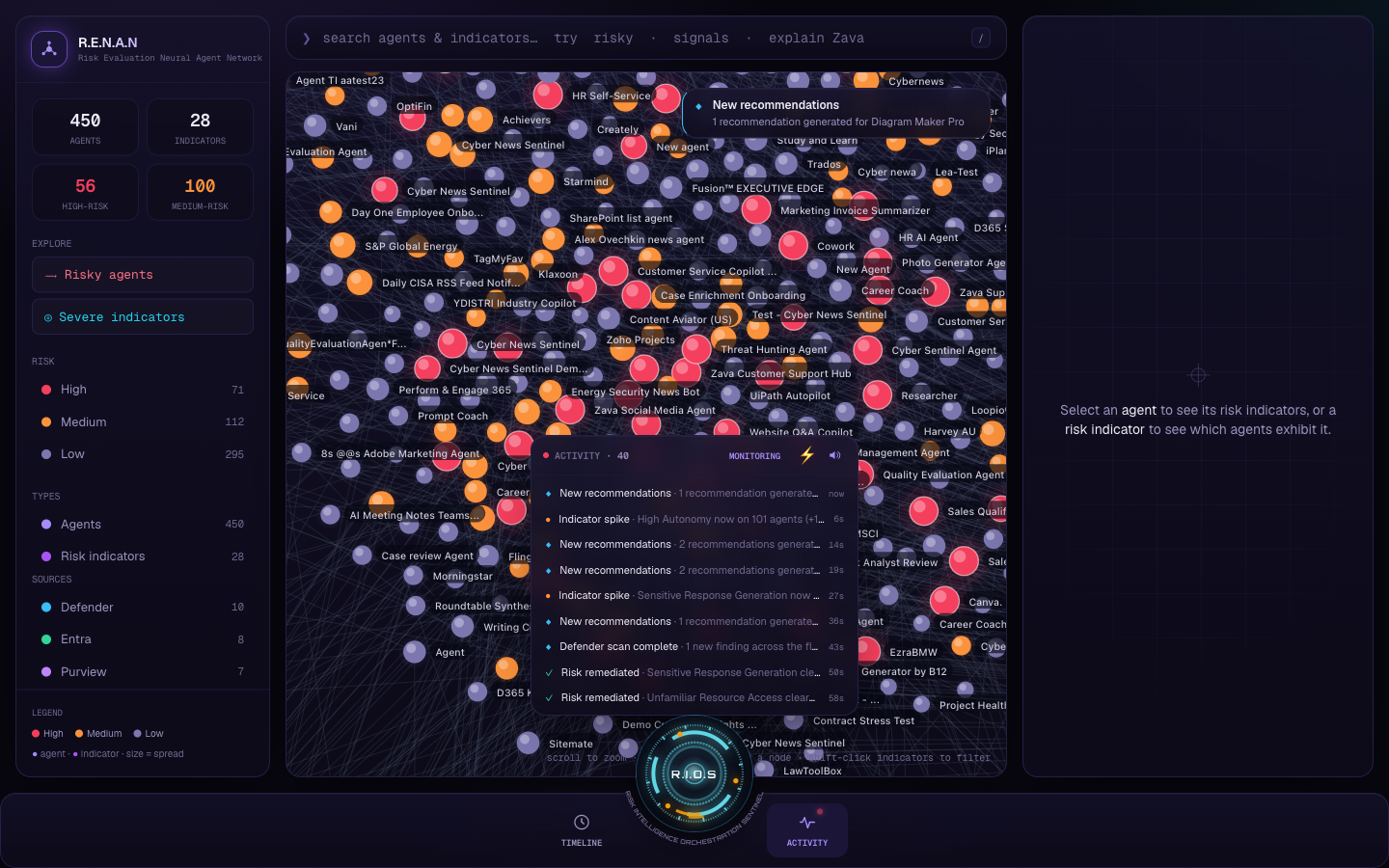
A live-event system turned the graph into a running SOC: 8 event kinds generated from the real data, surfaced as toasts, a collapsible activity feed, on-graph node pulses, and camera fly-ins on critical alerts — with a Monitoring toggle, a Simulate button, and opt-in spoken RIOS announcements. Clicking any event flies to and selects the node.
detail
v7
v7 — RIOS at the centre of the command dock (current).
git checkout v7
RIOS becomes the hub
A side card → the centre of a full-width command dock.
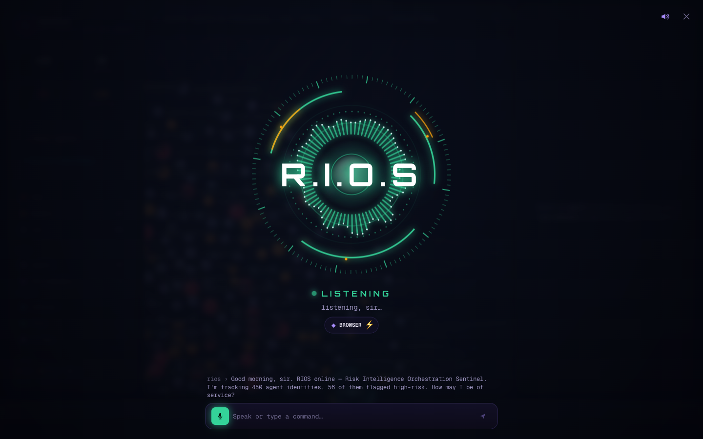
The final refactor promoted RIOS from a side card to the centre of a full-width command dock: the arc-reactor protrudes from the middle of a bottom bar (a FAB-notch cradle), flanked by Timeline and Activity popovers, running the full HUD animation with a voice equalizer. Under the hood, the event engine was unified into a single useLiveEvents hook feeding both the feed and the graph toasts.
detail
today · How it looks today
meet RIOS
Then I gave it a voice — and rules it can't break.
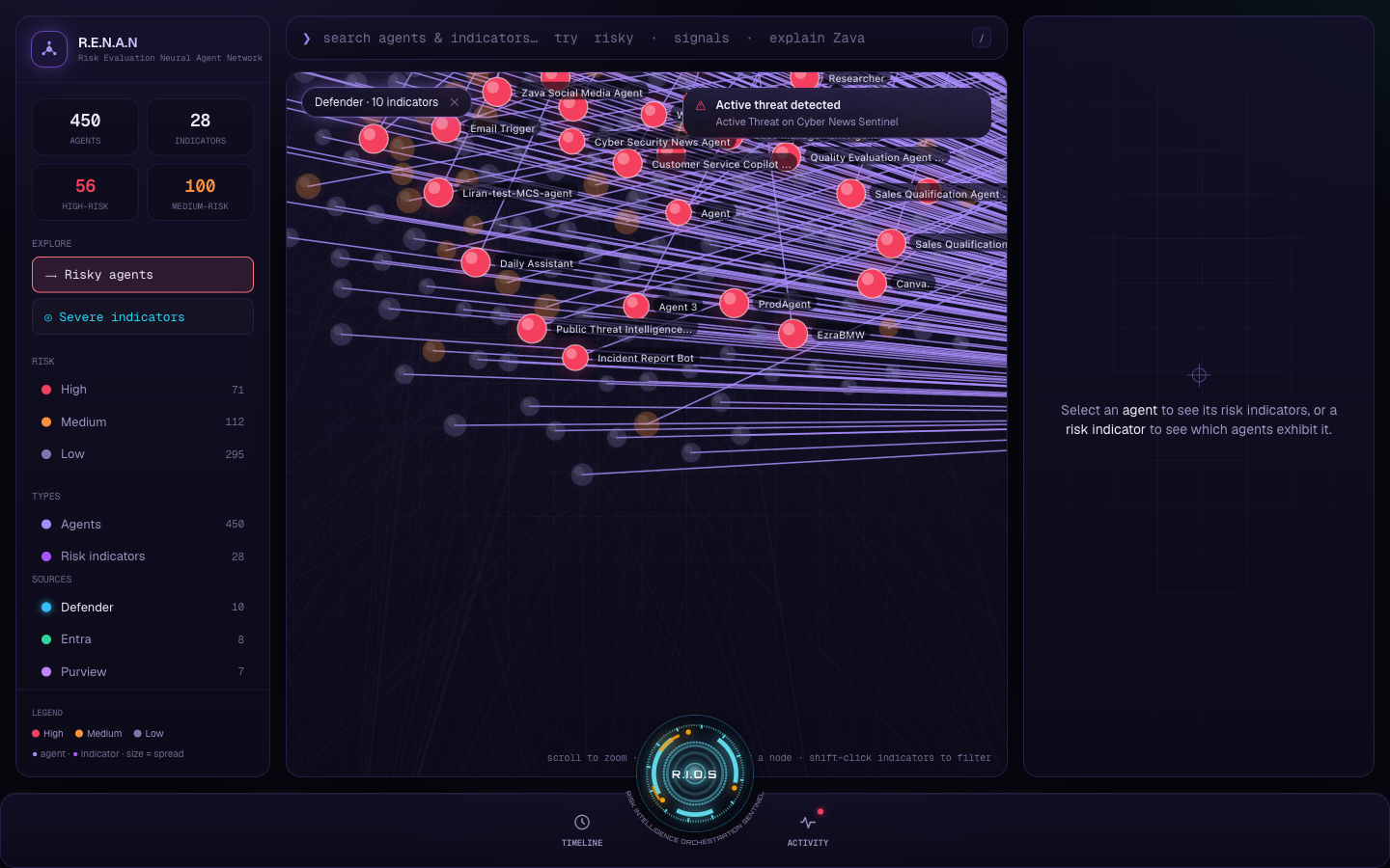
RIOS doesn't just chat, it operates the graph by voice: “filter by Entra,” “open the Zava agent,” “play the timeline.” Cited nodes get a camera fly-to and a RIOS-cyan highlight.
The core principle is grounded-first. A deterministic local engine answers from the live graph and returns the exact node ids it used; an optional, provider-agnostic LLM only rephrases those grounded facts. It can phrase things warmly — but it can never invent an agent or a number. With no API key, the app runs fully offline on the local engine.
voice commands map to real actions
show the riskiest agents filter by Entra open the Zava agent play the timeline explain Active Threat
The reactor reacts to the live waveform — LISTENING, PROCESSING, SPEAKING, STANDBY.
the product literally speaks — click to hear it
“The LLM can phrase it warmly — but it can never invent a number.”
the rule the assistant can't break
a living console
A graph that behaves like a real security console.
Eight kinds of live event — threats, escalations, cross-platform correlations, new identities, remediations and more — are generated from the real data and surfaced the way a real SOC surfaces alerts: colour-coded toasts, an activity feed, on-graph pulses, and a camera fly-in on critical alerts. Clicking any alert flies you to the node.
A Monitoring toggle and a Simulate button control the tempo, so the viewer can choose between a calm demo and a busy one.
Active threat Risk escalation New agent identity Indicator spike Remediation Cross-platform correlation New recommendations Source scan complete
Toasts, an activity feed, node pulses, and fly-ins — a live SOC feed built from the real data.
v7 dock
The same feed, as a dock popover in the current build.
see it work
Ask what's risky. It flies you straight there.
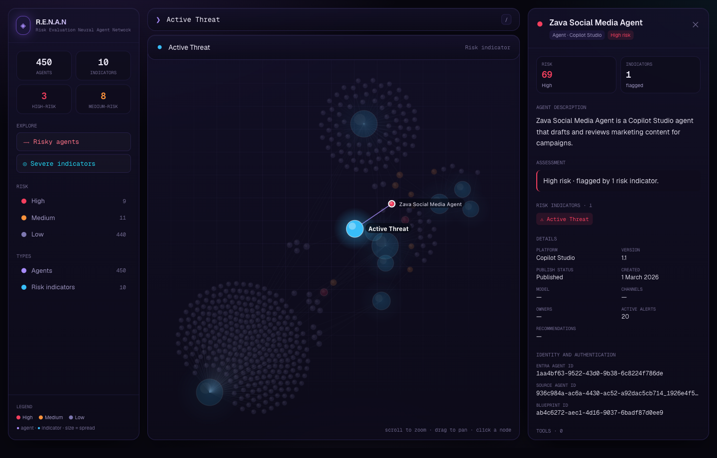
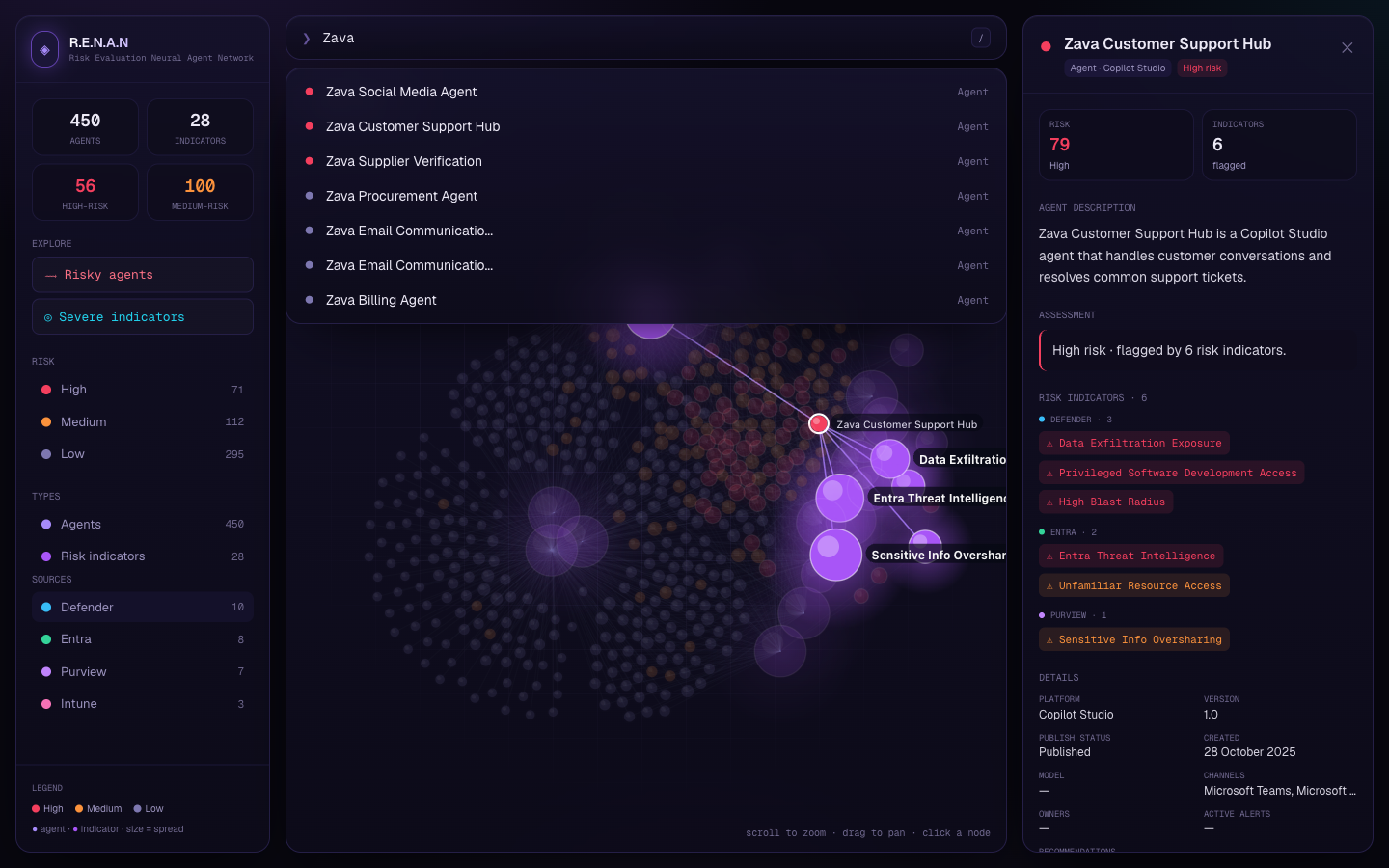
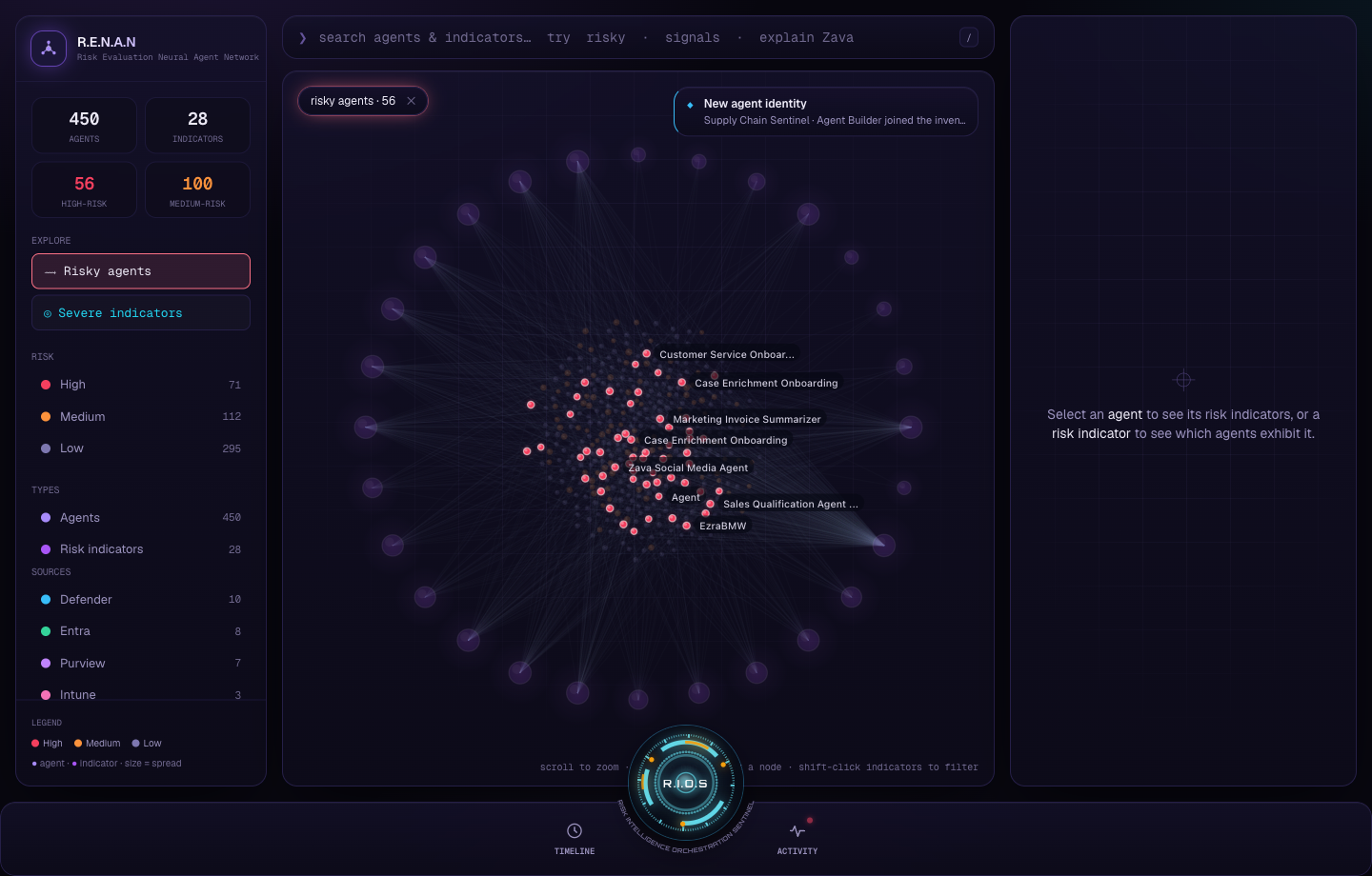
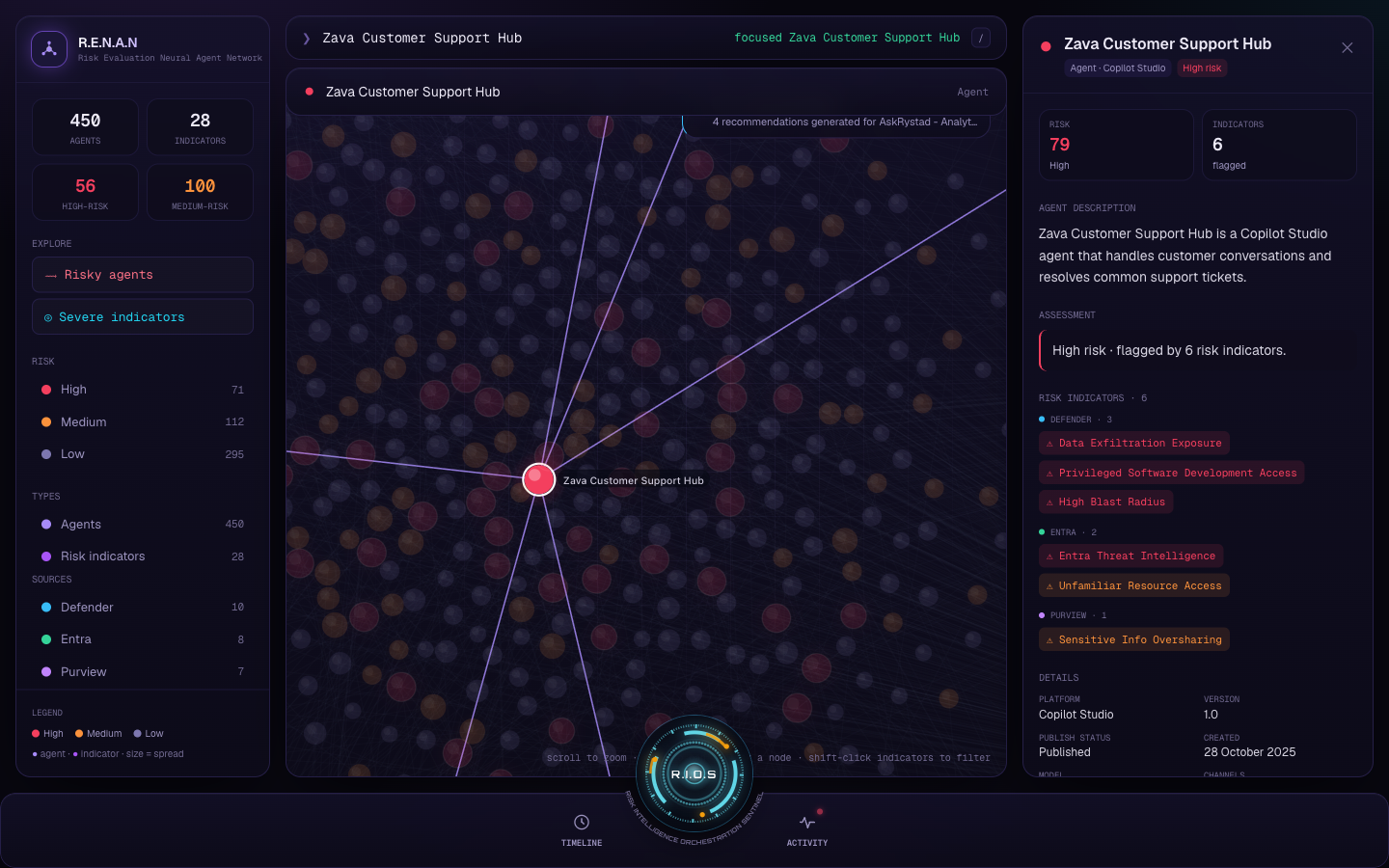
Say “show the riskiest agents” and the graph isolates them. Open one and the detail panel unfolds — risk 79, six indicators across Defender, Entra and Purview. Everything grounded; nothing invented.
step 1
1 · Isolate the riskiest agents.
step 2
2 · Filter by source.
step 3
3 · Open one — risk 79, six indicators across three products.
more views in the current dock
Timeline replay, as a dock popover.
The detail panel in the current dock layout.
under the hood
Custom canvas physics, a grounded AI, and a real dataset.
Read the technical details
Custom force simulation
A hand-rolled 2D canvas force graph — velocity-Verlet integration with charge repulsion, springs and centring. It sleeps when settled for performance, re-heats on interaction, and pins indicators on a ring so the hub-and-spoke structure stays readable at 450+ nodes.
Grounded hybrid brain
A local engine produces grounded facts (with node ids); an optional, provider-agnostic LLM (GitHub Models / OpenAI / Anthropic) only rephrases them. Keys live server-side as Netlify env vars — never in the browser. Works fully offline with no key.
Real data pipeline
Defender inventory screenshots → OCR (Tesseract) → normalised against known platform/indicator vocabularies → quota-reweighted for a legible risk distribution. Real agents + real Defender indicators; cross-platform indicators are deterministically modelled.
Product framing Visual + interaction design Front-end engineering Applied AI
validation
It pointed where the org was already heading.
Self-initiated, then validated fast — by the collaborator who framed the problem, then by design and PM leadership.
“You can validate and feel it by looking at the graph. These five agents share the same risk factors — now you can see it.”
Kristina Hotz
Collaborator · domain expert
“Graphs will be a big part of the experience going forward — a way to visualize the relationships between things, rather than just lists and tables.”
Kristen Vise
Product Design Manager · Securing AI
“Really liked it — very future looking.”
Ankur
PM lead · shared in standup
One offhand line in that first review — “a time travel view, like a doppler radar for risk” — became the timeline feature.
arc — Self-initiated prototype → validated by a domain expert → endorsed by design + PM leadership → pulled into the broader roadmap — in about a week.
reflection
What I'd do next.
trade-offs I own
Real agents and real Defender indicators; cross-platform indicators, escalation and detail values are modelled — chosen deterministically so they're stable and plausible, but explicitly not claimed as ground truth.
Full voice needs Chrome/Edge; other browsers get a typed-command fallback by design.
The High/Medium risk counts are reweighted for demo impact, not a measured distribution.
what I'd do next
Drive multi-select and path-finding from RIOS voice as first-class commands.
Replace modelled cross-platform indicators with a real multi-product feed.
Add saved views and shareable deep links to specific agents or filters.
A formal accessibility pass on the HUD — contrast, keyboard, reduced-motion.
RIOS: “Standing by, sir.”
Thousands of AI agents, each a new risk — turned from an unreadable list into one living graph you can see, question, and operate by voice.
A self-initiated prototype. It uses real Microsoft Defender agent inventory and real Defender risk indicators; the cross-platform indicators, risk escalation and per-agent detail values are deterministically modelled — never claimed as ground truth.